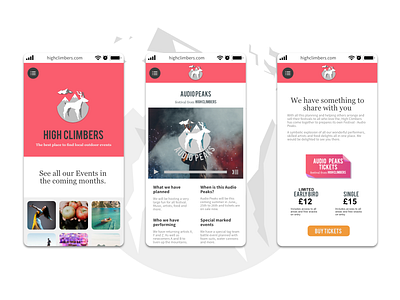
Mobile High Climbers UI Trial Pages
#FA5D6E Colour Version of the High Climbers Mobile pages. Going more simple and clean with High Climbers, including the prominent 2017-18 gradient style in a smaller portion of the whole design and more single block colours that is making a come back in 2019-20.
Staying with the two fonts, logo font excluded. Including the same content on the larger web page designs and the yellow buy tickets button which is purposeful to counter the main red theme.
Accordion logo and menu at the top that adjusts as you scroll and put all menu items inside the menu button. Images from Unsplash.
More by Stuart Wilson View profile
Like
