Daily UI / UX - 005
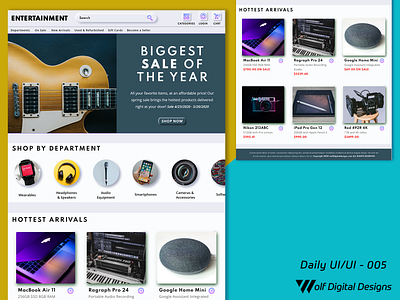
This is today's UI / UX entry. This is a follow up to last concepts, and the culmination of a final landing page project that contains entries UX daily entries 001-004. Today's post is the
entire home page for the music/entertainment store, including all sections such as navigation, subheader, departments, and products. The idea was to integrate all previous segments and put them together like puzzle pieces.
All page sections still have neumorphism elements that still brings them together as a cohesive piece. There are subtle hints of
analogous colors throughtout the home page (such as green, blue, etc.), and that gives a creates a common palette on the entire page.
If you like what you see, please show some love by hitting "L", and/or provide any constructive feedback! ❤️

