Daily UI / UX - 002
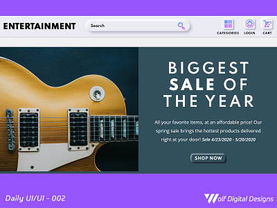
This is today's UI / UX entry. This is based on a music/entertainment store that works like a marketplace (similar to Amazon or eBay). I decided to expand from my previous entry, and elaborate a hero landing page. I wanted to use a color scheme that allowed the original image background to be part of the "hero" section, and integrate the same neumorphic design from the navigation bar for the CTA.
If you like what you see, show some love by hitting "L", and provide any constructive feedback! ❤️
More by Daniel Aragon View profile
Like
