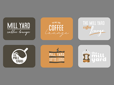
The Mill Yard Coffee Lounge - Rebrand
I have a friend who used to run and cook in a cafe, and I thought I would have a go at rebranding his logo using his colour palette.
The top row would be the simpler logo types for branding without going into iconography just yet. The first one is the closest resemblance to the one they use now, without 'the' prefixing 'mill yard'.
Using different punch words in each section. My thinking was lounge should be a relaxed script font here in all cases while coffee strode across in various forms. The mill yard I kept bold and robust for its namesake and to juxtapose.
Below I went for more iconography and used the three main things that I remember his cafe for; coffee, club sandwiches and cookies/cakes.
More by Stuart Wilson View profile
Like
