Marengo

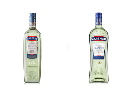
Within the redesign project the bottle has changed. Developed with blow-blow technology, i.e. convex bottom formation, it grew higher, larger in its value and thus more prominent on the shelves. Though the colours of Marengo were not changed to save brand recognition, the label design has been upgraded. Logo grew wider and more visible. The letters are entirely handwritten. Though the coat-of-arms is designed from scratch, it preserved the principal features of the old one.