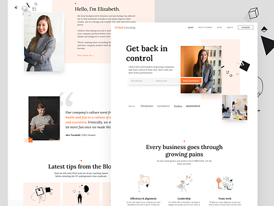
O'neill Landing page
Hello Dribbblers,
I am happy to share this latest side project that I produced this past week. The scope of the project was to have a fresh take on Mrs. O'Neill old web site. Improve communication with easy to read text blocks, followed by playful illustrations. Negative space, clear "call to action" elements and big bold typography are some of the core building blocks of this design.
Stay tuned for the rest of the pages that are still in progress.
As always stay tuned, dribbbly and awesome!
Thank you for watching.
Illustration source: https://www.abstrakt.design/
More by Cristian Todorovic View profile
Like

