EATME | Logo Design & Branding
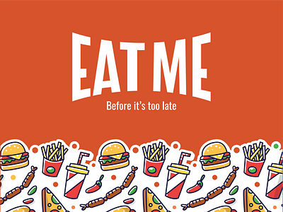
Eatme is a concept for an Italian fast food.
The brand / logo uses two elements: logotype and pay-off. It needs a simple and clear logo to distinguish and impose itself on the market, for this reason the logo is represented with a double inclination (upper and lower) to give an idea of 'bite' by whetting the appetite thanks to the quality of its products carefully selected.
On the contrary, the "Before it's too late" pay-off, ironically invites its customers to taste their delicious dishes as soon as possible just before their time arrives. An extremely sarcastic comparison, but with the aim of intriguing and attracting Italian families.
See the full project on Behance: https://www.behance.net/gallery/76666131/EATME-Logo-Design-Branding
Thanks to @Emanuele Agosta that gave me the possibility to join Dribbble as a player.
