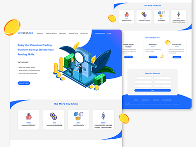
Landing Page for Financial Services - UI Concept
The main goal was for it to be easy to understand and interesting to look at, which I think go hand-in-hand. It is light, with a lot of white space, kept the colors at bay and used them when most needed. Some fun and modern illustrations and icons were added.
In modern days a well presented website that is nice to look at and easy to understand is a big part of winning the client.
Every section is a bit different, yet designed so that it looks in the whole design.
More by Silvia Ivanova View profile
Like
