Atlanta Mission: Mid-Year Campaign

With a bold and striking black and yellow brand, the challenge on our end is how to keep Atlanta Mission's pieces fresh and differentiated from each other. This booklet was a new approach, exposing a more gentle side with softer grays, accent blues, and whites. It also included a touch of hand-scripted lettering.
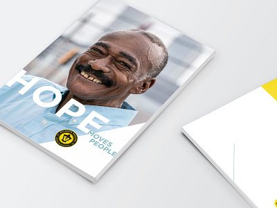
Images are a pillar of the Atlanta Mission brand full of clear faces, unity, togetherness, strong light, and hope. The people here are truly what helps Atlanta Mission stand out in the crowd of nonprofits and humanitarian organizations.
A key to this being a successful design would be connecting the reader to all of the different faces and stories of homelessness. Action comes from conviction, and conviction comes from connection.