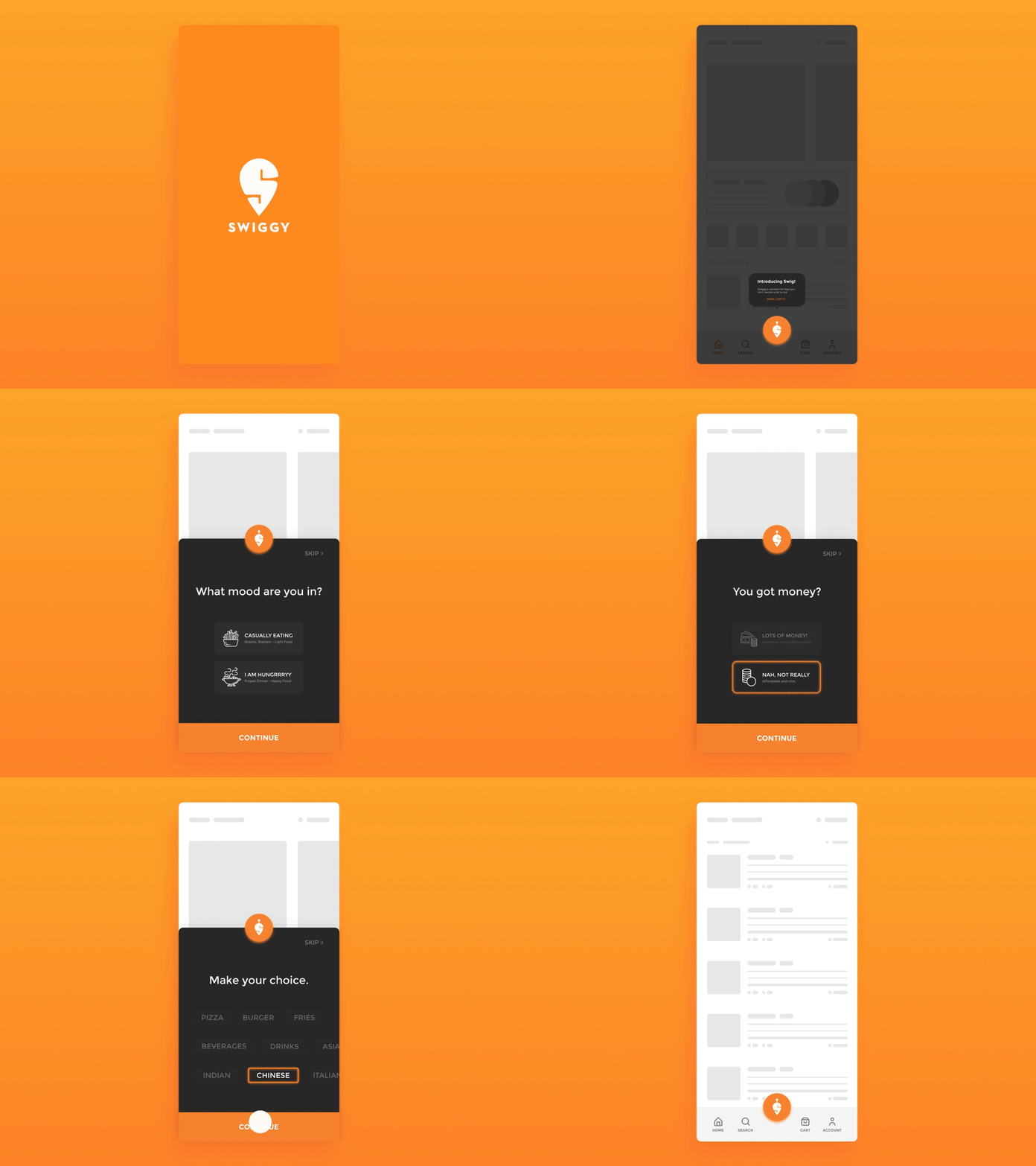
Swiggy Assist Interaction
Here is a concept design for 'Swig'. It was inspired by the normal observation of people having trouble deciding on something to eat when they don't have a plan. There are times when you want to order something expensive VS when you just want to order something cheap and fulfilling. There are times when you have been eating Italian for a long time and want to try something new. There are times when you want a meal VS when you just want to have some casual snacks.
When people are indecisive about what they wants to eat, providing them with a variety of options on the home screen can be very overwhelming. But we can't just ask them to choose from a handful of options either which we randomly curated.
Instead, the 'FILTERS' can be implemented in a more playful manner which helps the user articulate his thoughts. This way we let the user have the control over what he wants to eat while narrowing down the restaurant list based on the selected choices to help the user focus. Might even lead to faster checkout by reducing the amount of time taken by the user to make a choice.
