Miranda e Morgado Advogados

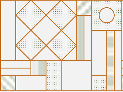
Miranda and Morgado Advogados is a law firm in Esposende that has recently undergone a restructuring process, including an image renewal. With nineteen years of experience in the field, their values were built on quality, pragmatism, and professionalism, which we wanted to represent in their new identity. The office and work environment of this law firm has a classic architecture that inspired us and led us to transpose it into the logo. For being a team of lawyers, we started to merge the letters MMA, transforming them into an elegant and classic air seal. From the basic forms of logo construction (if we exclude parts, we get squares, circles, and rectangles) a pattern is generated that unfolds along the identity. This was developed with a palette of sober and neutral colors, representing the seriousness of the activity, with notes of pine green and gold, combined with natural textures, giving it elegance, grace and balance. We also created an illustrated wallpaper to embellish one of the rooms, whose theme had thémis as the central figure.
Full project here:
https://www.behance.net/gallery/82131353/Miranda-e-Morgado-Advogados