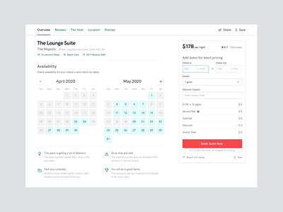
Hotel Suite Booking Redesign
🤘 Hello Peeps
Redesigned an old version of a hotel suite booking screen of a famous product(Airbnb😅).
This was inspired by an experiment from GoodUI on Airbnb.
🧠 What I learned
1. Spacing can make or break your design.
2. Texture can be used as a color. Texture as background can create contrast or convey some language.
3. Neutral colors can be used to signify default/disabled/unavailable. Accents attract attention and can be implemented to define importance/clickable.
4. Help tips are hella effective.
5. Contrast is key for typography. Skip that weight.
6. You learn a lot about the original thinking behind decisions while redesigning.
🎀 Hope this was helpful in someway!
More by Gazi Taufiq View profile
Like
