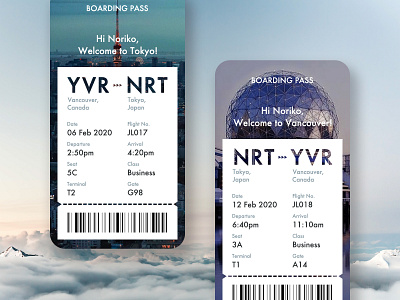
Boarding Pass
My Day#24 challenge in DailyUi.
This is a UX/UI case study of a mobile boarding pass screen designed to enhance the travel experience for users. The design takes advantage of the digital format of boarding passes, featuring a photo of the city where the user is flying as the background to create a more engaging and personalized experience.
By providing a clear and concise summary of the user’s flight details and boarding information, this design aims to streamline the check-in process and make it easier for users to manage their travel plans on the go.
More by Noriko G View profile
Like
