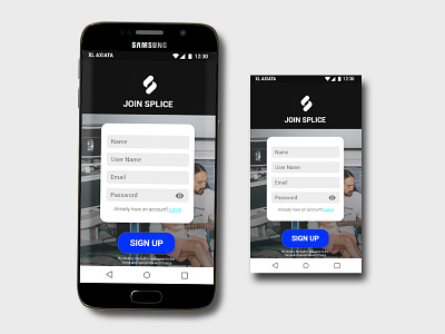
Splice Sign Up
I have been using Splice and looking at their design. They like to use black and white for most of their ui design.
In this #DailyUI challenge I redesign their sign up form. Without going way too far from their branding color, I make it more interesting by putting a photo of a passionate musician playing his instrument on the background.
The idea is to make the user feel can't wait to sign up so they can passionately make music as represented by the guy in the picture.
More by Julius Tanoey View profile
Like
