We don’t always make a detailed concept video, but when we do, we call it “Web Motion Art Direction.”
In order to bring the website storyline full circle and visualize its definitive look and feel before we hand over our designs to the...
Keeping in mind the asset complexity and presentation of information, porting the desktop version of Healthx’s website to mobile was a real pain in the gluteus, technically speaking – we did a lot of sitting; especially since we didn’t c...
Even though everything started as a simple concept for a coming soon few web page, we decided to do our best to help Healthx achieve the growth they were striving for and realize their vision. So, we dug deep into their goals and content...
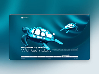
What you see here is the final piece of the visual content puzzle. In contrast to the branding portion of our work with Healthx, which focused on the human element of medical care, these assets are all about the technology behind it.
E...
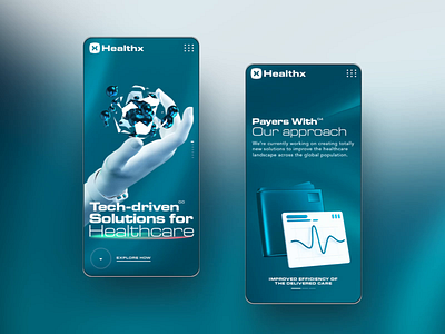
As promised, here are the main visuals for the Patients, Healthcare, and Payers pages of Healthx’s coming soon website; presented in all their shiny, morphing glory.
Yep, you read that right – these aren’t just for showing off on Dribb...
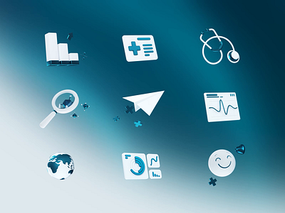
Here they are – the custom animated icons for Healthx’s Technology page.
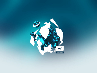
These are some abstractions we made to convey the technological aspect of services offered by Healthx. Being abstractions – especially abstractions related to a v...
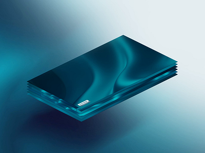
In contrast to the warm feel of the branding elements, we went with a darker, tech-centric mood for the Healthx website.
After plenty of iteration, we settled on a solution that elegantly fills the backdrop and provides a “depth of fee...
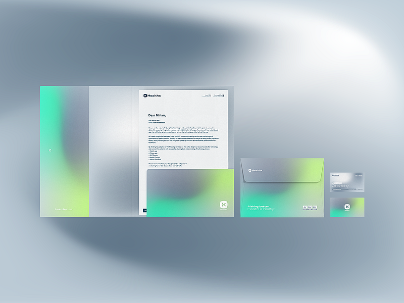
Like every serious client, or competent intelligence agent, Healthx also needed a way to hand out their info at cocktail parties. Yep, we’re talking about visit cards and stationary material.
Essentially, the small print material is an...